A lot of firms run AR like the weather. You look outside. You guess. You hope it clears up.
One week, you’re confident in your cash position; the next, you’re scrutinizing the bank balance daily. The numbers exist in a ledger somewhere, but they don’t feel usable. And when leadership decisions are made with a mix of instinct and anxiety, you start to see a specific, painful pattern:
- Hiring pauses because “cash feels thin.”
- Tool decisions get delayed another quarter.
- Bad-fit projects get accepted just to “keep the pipeline moving.”
- Fee increases get postponed to avoid “rocking the boat.”
- Partners start asking for daily status updates, creating a mountain of manual work.
Nobody is doing this on purpose. You’re likely drowning in numbers, yet you’re still forced to make gut calls because your current reporting doesn't point toward a clear next step.
In this article, we’ll show you how to build a high-signal dashboard that turns stagnant numbers into clear, decisive action.
Key takeaways
- A dashboard has to produce decisions: If it doesn’t surface exceptions and next steps, it’s just a report.
- Definitions kill debates: Fixed KPI definitions prevent the “same numbers, different stories” trap.
- Most AR pain is created upstream: Agreements, triggers, payment behavior, and scope control determine whether invoices become exceptions.
- Boring is the goal: A leader-grade dashboard should feel calm because the system is stable.
By shifting your focus from "reporting the past" to "deciding the future," you can move away from these high-stress patterns and toward a predictable operating model.
The Emperor’s New Clothes problem in AR
Here’s a common, albeit uncomfortable, dynamic: a room full of leaders nodding at a report while everyone privately questions the numbers.
Like the Emperor’s New Clothes, where an entire city pretends to see a magnificent outfit that doesn’t exist, AR dashboards often create a collective illusion. One person says, “AR is fine.” Another says, “AR is getting worse.” Both are looking at the same chart, but because the definitions are vague, they’re forced to bring their own stories to the table to avoid admitting that no one actually knows what’s happening.
Most firms treat AR aging like a feeling. “This looks bad,” or “This feels normal.” But AR aging isn’t a mood; it’s a system signal. If you don’t treat it like one, you’ll keep reacting to the data instead of improving the system. The Emperor’s New Clothes effect takes over when:
- KPIs are undefined: Everyone has their own math for “overdue.” Some count from the invoice date, others from the due date. When a KPI means something different to each person, you don’t have data—you have a talking point.
- Filters change week to week: One week, it’s “Total AR,” the next week, it’s “AR minus disputes.” These changes might be well-intended, but they break trust. Leadership starts to feel like the numbers are being curated to look better than they are.
- Payment status is a mystery: “Is the check in the mail?” “Did the card fail?” If the dashboard can’t answer these, people fill the gap with assumptions. That creates unnecessary stress and endless internal follow-ups.
- Invoices and payments don’t match: When payments can’t be confidently matched to invoices, the dashboard becomes an argument about what’s “really” paid. Your team gets pulled into "detective work" instead of the high-value tasks you actually hired them for.
A real dashboard replaces these vibes with proof. Once you remove the ambiguity, the dashboard can finally do what it’s supposed to do: help leaders decide what to do next.
The high-signal dashboard that actually works
A leader-grade AR dashboard should actually feel boring, because the system is stable. Boring means predictable. It means you can glance at it and know exactly where your attention is required.
If you’re building a dashboard, start with these seven metrics. They cover what leaders actually need to know without creating a wall of numbers.
Cash predictability: The “can we breathe?” view
This answers the question leadership asks every morning: “Are we safe?”
1. Expected receipts (14 & 30 days)
Not booked revenue. Not what you hope to collect. This is the cash likely to land in the bank based on known invoice dates and known payment behavior.
The key: Exclude anything in an exception state unless there is a confirmed payment date. This prevents wishful thinking from creeping into forecasts.
2. Locked-in vs. at-risk revenue
This is where “vibes” usually live. People feel revenue is locked in because the work is done. But “work done” is not the same as “cash predictable.” Locked-in means the path to payment is clear. At-risk means something is missing or drifting.
The key: Use this as a focus tool, not a moral judgment. If at-risk revenue grows, it’s a sign that your upstream rules are slipping or your exceptions are piling up.
3. Payment failure queue
A simple count of failed payments and expiring cards. This is a leading indicator. If this queue grows, you’re about to have a spike in overdue invoices and more time lost to manual outreach.
The key: Assign a clear owner to this queue. The goal is to turn "going on a chase" into a known, repeatable process for clearing failures.
By separating stable cash from shaky cash, this section ensures that you spend your energy fixing problems rather than wondering if you can make payroll.
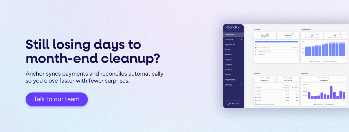
AR health: The “where is it stuck?” view
Healthy AR isn’t “zero overdue.” Healthy AR means exceptions are small, understood, and handled consistently.
4. Aging with a “rule.”
AR aging buckets are often just noise. Without a trigger, teams treat every delay as a crisis or ignore it until it becomes a disaster.
The key: Anything 31+ days is an exception unless it’s in a documented dispute state. This stops the panic over minor delays and forces documentation of real issues.
5. Dispute count & dollars
A dispute is not just “late.” It’s “blocked.” Blocked money needs a different fix than late money: scope alignment, a corrected invoice, or a formal amendment.
The key: If dispute dollars trend up, it is a signal that your "upstream" process is producing invoices that don’t feel obvious or fair to the client.
6. Collection effectiveness proxy
You don’t need complicated formulas. Track the % of invoices paid on time versus the % paid within 7 days of the due date.
The key: If you improve your system, these numbers should rise month over month. If they stay flat, you are likely treating the symptoms rather than the mechanism.
When these three metrics are visible, you stop chasing every dollar and start managing by exception, drastically reducing your team's cognitive load.
System signals (the “how do we fix this?” view)
If your dashboard stops at totals, it will only describe the work. This section is where you turn AR into a fixable system.
7. Exceptions by reason code
This is the most important metric on the dashboard because it points to the root cause. "Exception" means the invoice can’t follow the normal path.
The key: Use codes like Scope mismatch, Missing approval, or Wrong contact. Labeling the blocker tells you exactly where the "engine" is broken.
Reason codes reduce time wasted guessing and make ownership clear. Once you can see which patterns keep recurring, you can move away from reporting on fires and start building a fireproof system.
Kill the debate: Definitions that stick
If two partners define a KPI differently, the KPI is useless. The fastest way to lose trust in a dashboard is to let definitions change depending on who is talking.
Pick these definitions once and write them down:
- Paid: Payment has posted and is matched to the invoice.
- Pending: Invoice issued, payment not posted, no exception flag.
- At risk: Invoice is past due OR missing a required step (approval/payment method).
- Disputed: Client has raised an issue that’s blocking payment until it’s resolved.
- Exception: Any invoice that cannot follow the default payment path without a human fix.
Establishing this shared reality is the only way to stop the "storytelling contest" in your leadership meetings and start executing on the data.
Why your dashboard is only as good as your “upstream.”
A dashboard is just a mirror. If your operations are messy, the mirror will reflect that mess. To keep the dashboard calm, you have to fix the work-to-cash cycle that feeds it. AR problems don’t begin in AR; they begin earlier:
- Agreements set the rules: If agreements are vague, every invoice becomes negotiable. That creates disputes and delays.
- Triggers drive the timing: When billing triggers are manual, invoicing "drifts." This creates at-risk revenue before you even hit send.
- Payment behavior requires a system: If you collect payment info upfront, many invoices never become exceptions.
- Reconciliation creates proof: Clean matching of invoices to payments is what turns “we think” into “we know.”
Visibility isn’t a reporting problem. It’s an operating model problem. When the upstream process is tight, the dashboard reflects a stable, healthy business.
The 20-minute weekly review
If your AR meeting lasts an hour, your system is too noisy. A high-performing team only needs 20 minutes to focus attention where it matters:
- Review expected receipts (14 days): Confirm the “can we breathe?” status to keep leadership grounded in reality, not fear.
- Review the exceptions list; Don’t look at the entire AR list. Look only at what’s broken.
- Assign owners and next step dates: Every exception needs one owner and one specific "next step date" to prevent drift.
- Pick one upstream fix: Look at the top reason code for the month and choose one improvement (like standardizing AP contacts) to prevent that error from recurring.
This cadence turns the dashboard from a scoreboard you check once a month into a tool that proactively reduces your team's workload week by week.
The infrastructure of a calm system
A dashboard becomes reliable when it’s fed by a system that runs consistently. Anchor is designed to provide the "clean engine" for the entire work-to-cash chain. By automating proposals, triggers, collections, and reconciliation, Anchor ensures that your dashboard isn't a manual project you have to "clean up" every month—it’s a default reality.
When your system is stable, your visibility is perfect, and your leadership team can finally stop managing by vibes.
Ready to stop managing by vibe?
Book a call with an Anchor advisor, and we’ll help you map the most effective KPI set and exception rules for your firm. If you’re not ready for a call, start this Friday: add reason codes to your current AR spreadsheet and run an exceptions-only review.